Background :
Long Feng focus on supplying products and services to Power Plant in Indonesia. Our main focus is in the process of provisioning of goods and services for Indonesia’s Power Plants. We offer the total solutions that can provide our entire client needs while making sure that our service surpasses our competitors.
Challenge :
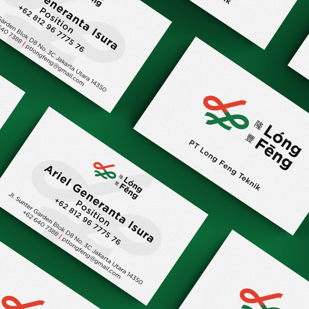
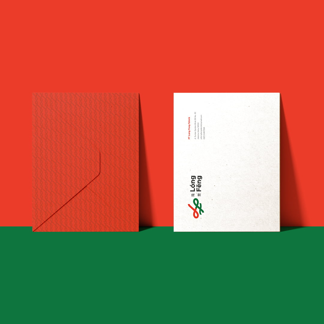
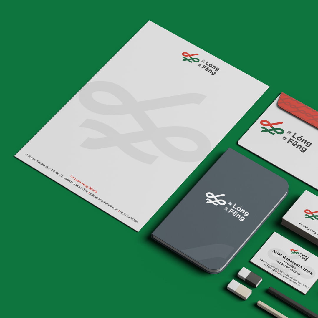
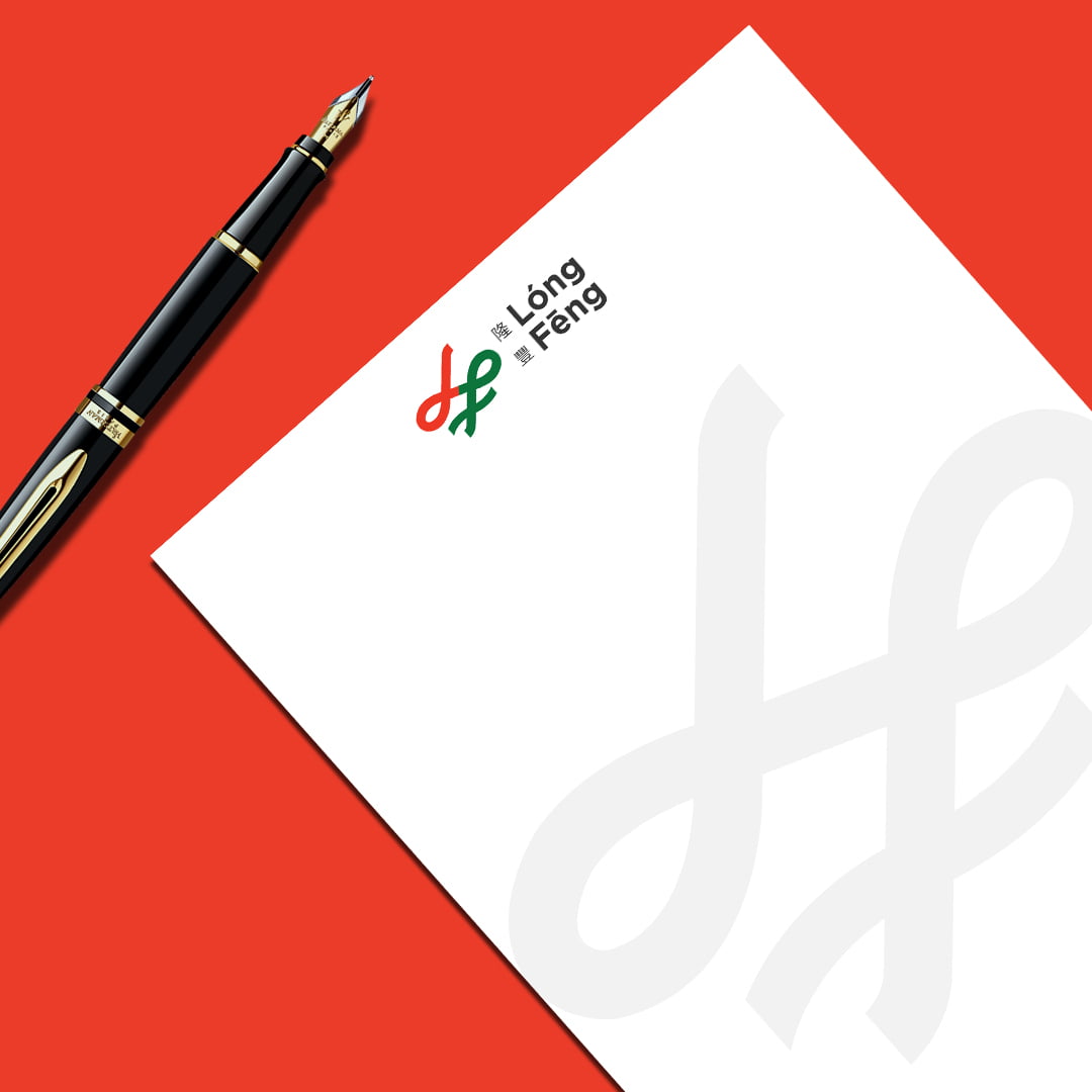
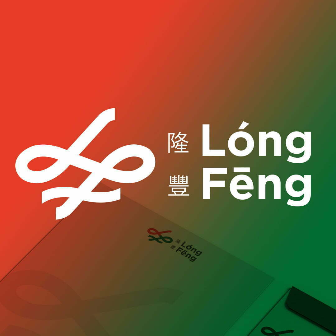
Long Feng Logo Inspired by the shape of infinity combined with the initials LF. Red is the color of ambition and passion, while green is for fertility. The meaning of the name Long Feng: 隆(long) from 生意興隆 (shēng yì xīng long) means business is smooth and long (sustainable) 豐 (fēng) from 豐收 (fēng shōu) means bountiful harvest. In other words, Long Fend is “A bountiful and sustainable harvest
Solution :
In understanding the meaning of their company, PT Long Feng Teknik took their brand’s name from the Chinese culture where it means “abudant and sustainable harvest” in supplying products and services in buillding an adamant reputation. Our assignment here was to make a visual identity using visible elements of their brand to create an impression for customers a perception that suits the brand’s name.